
Best Look/Worst Look - NFC South Edition

The NFC South is a fun division. It has a surprising amount of history for a group of four expansion teams, and together they offer a pretty strong uniform lineup. Even if there are some duds in this division, they’re more than offset by the good stuff. In fact, each team has multiple options for what I consider their best looks.
A reminder on the rules:
1 - The uniforms have to have appeared in a game. No concepts or yet-to-be-worn combinations. The uniforms also have to be a part of a team’s current uniform rotation. If they’ve discontinued a particular set they’re not going to be a part of our conversation.
2 - Alternates are okay, but no throwbacks. Throwbacks can be some of the best and worst-looking uniforms out there, but they’re generally designed with such specific parameters in mind that they’re almost too unique to consider here. We may do a future series on throwbacks.
Atlanta Falcons

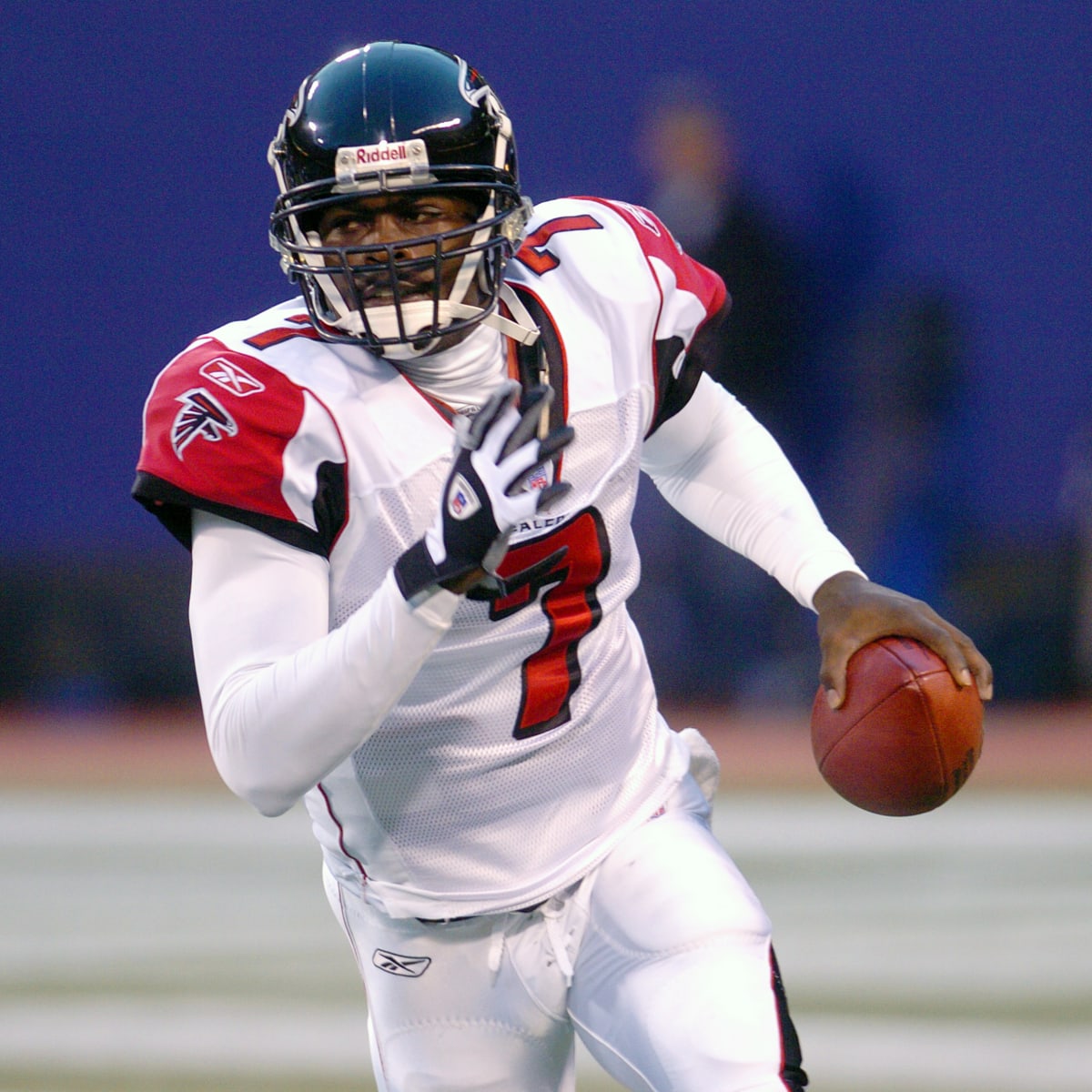
I never liked their Michael Vick-era rebrand outside of the logo. Too many gewgaws, tiny panels, and little stripes. Even the best of the bunch was just…a lot.
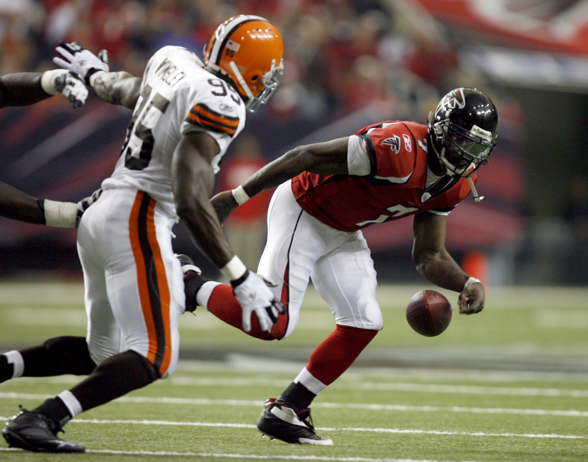
But the Falcons have some strong raw material to work with. Their black and red colors are about as bold as you can get, and they’re the only team that can boast that pairing as their primary colors. (The Cardinals come close, but black is just an accent color for them, no matter what they try to emphasize).
With that in mind, their black and white standard uniforms are, I think, their best outfit. It’s simple, it’s strong, and it’s a nice refinement of their previous uniforms.
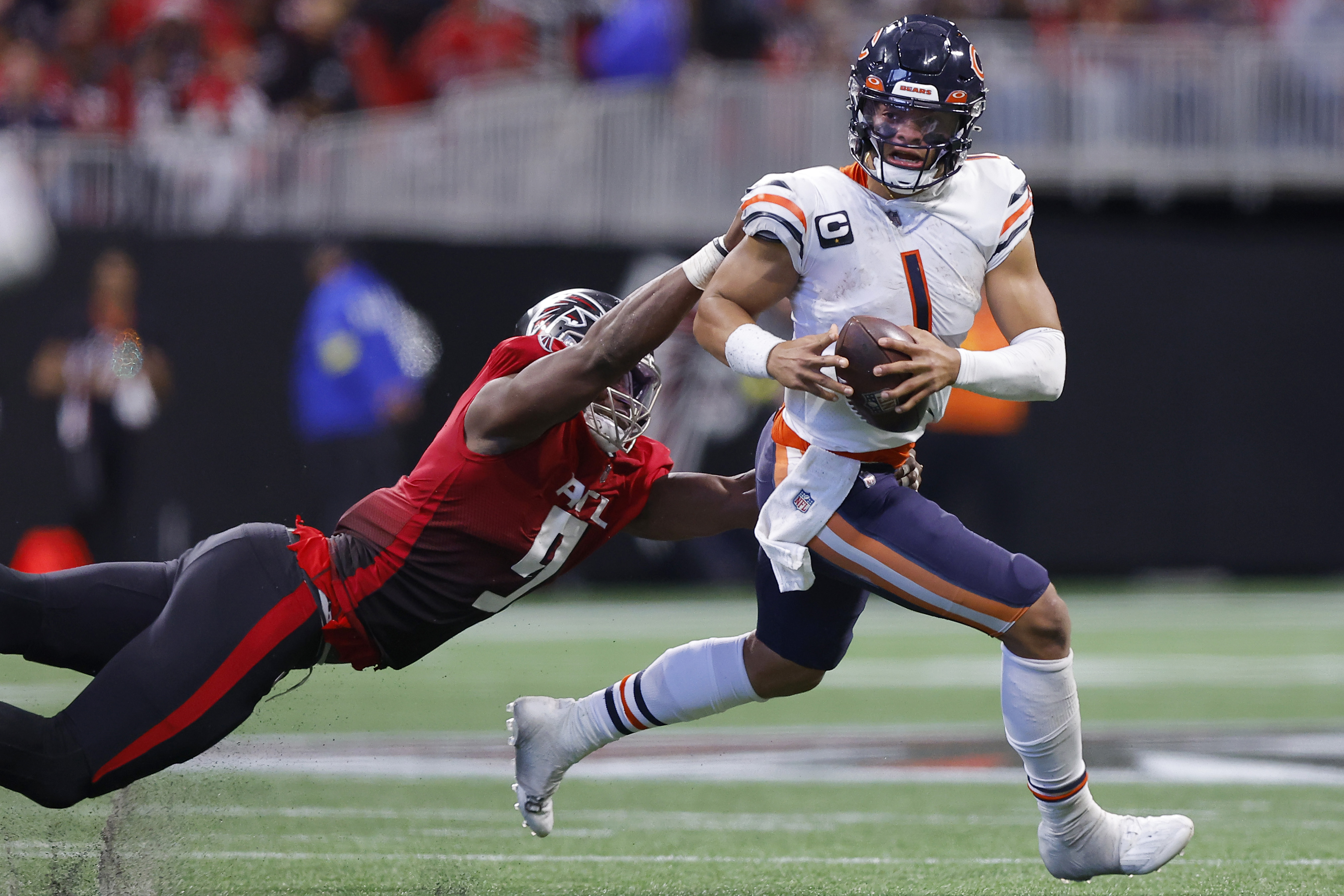
And that’s part of the reason their gradient uniforms are so bad. They took a look at the missteps of the previous rebrand, and then decided to try to one-up them a little bit, as a treat. Maybe they look okay on sleek receivers or other skill-position players, but even then they look wonky if they get slightly out of alignment.
To read the rest, support The Power Sweep on Patreon or Substack.